
Cox Media (Dashboard for Small Business Owners to Assess Media Campaigns)
While freelancing with creative agency Tallwave, I was asked to create a media campaign dashboard proof of concept for Cox Media, a paid media client of the agency, as part of an upsell effort for product design services. I was given the following requirements:
Users should be able to view a list of their existing and past media campaigns they’ve run for their business, as well as the ability to drill down and view more detailed metrics on a specific campaign
Users must have the contact information of their organization’s Cox Media representative viewable at all times
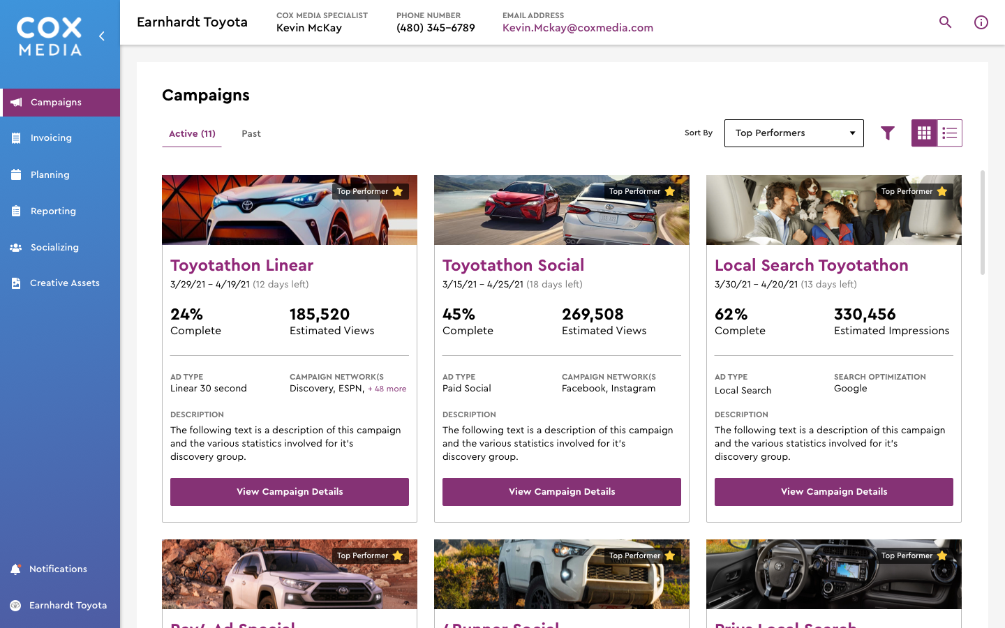
Dashboard Landing Page
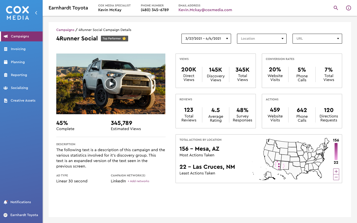
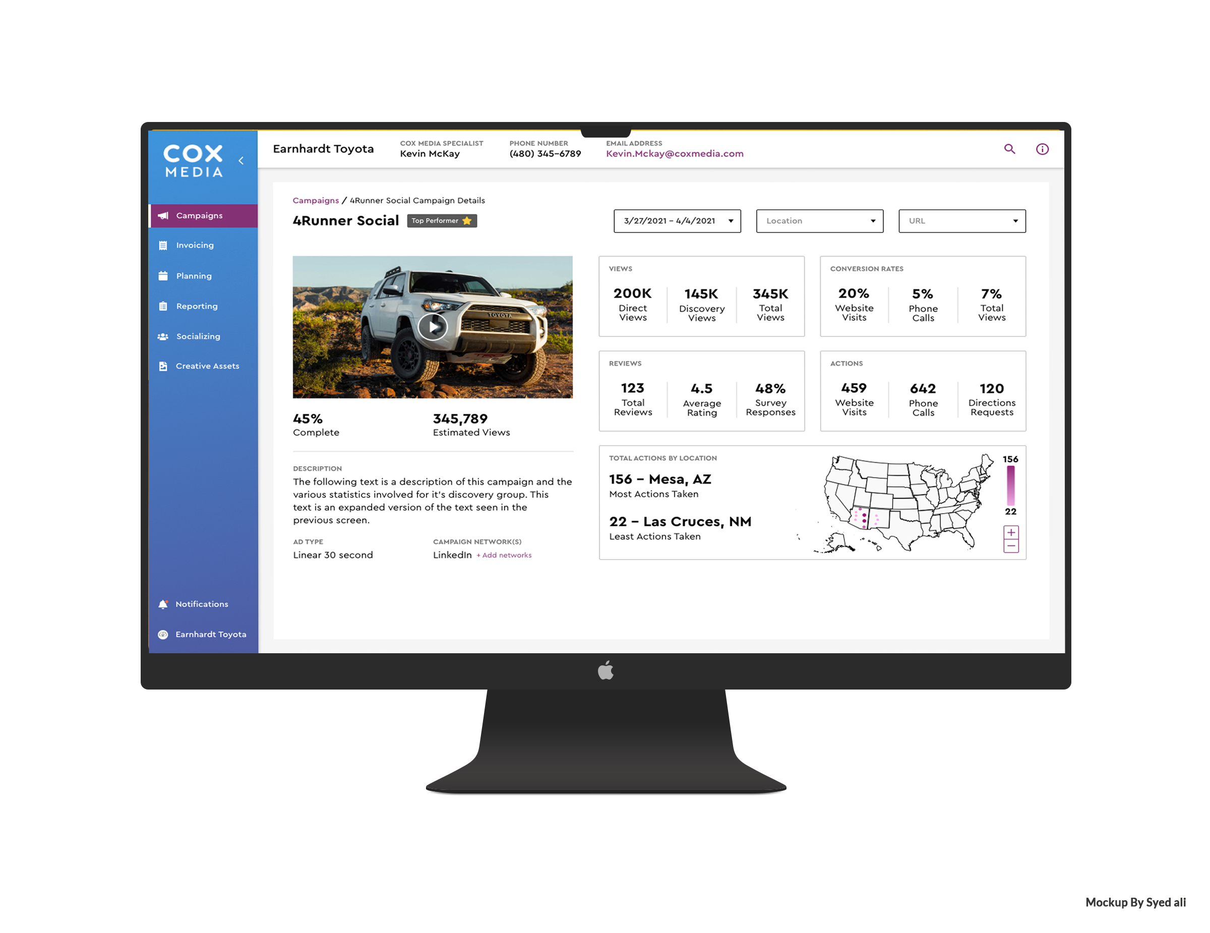
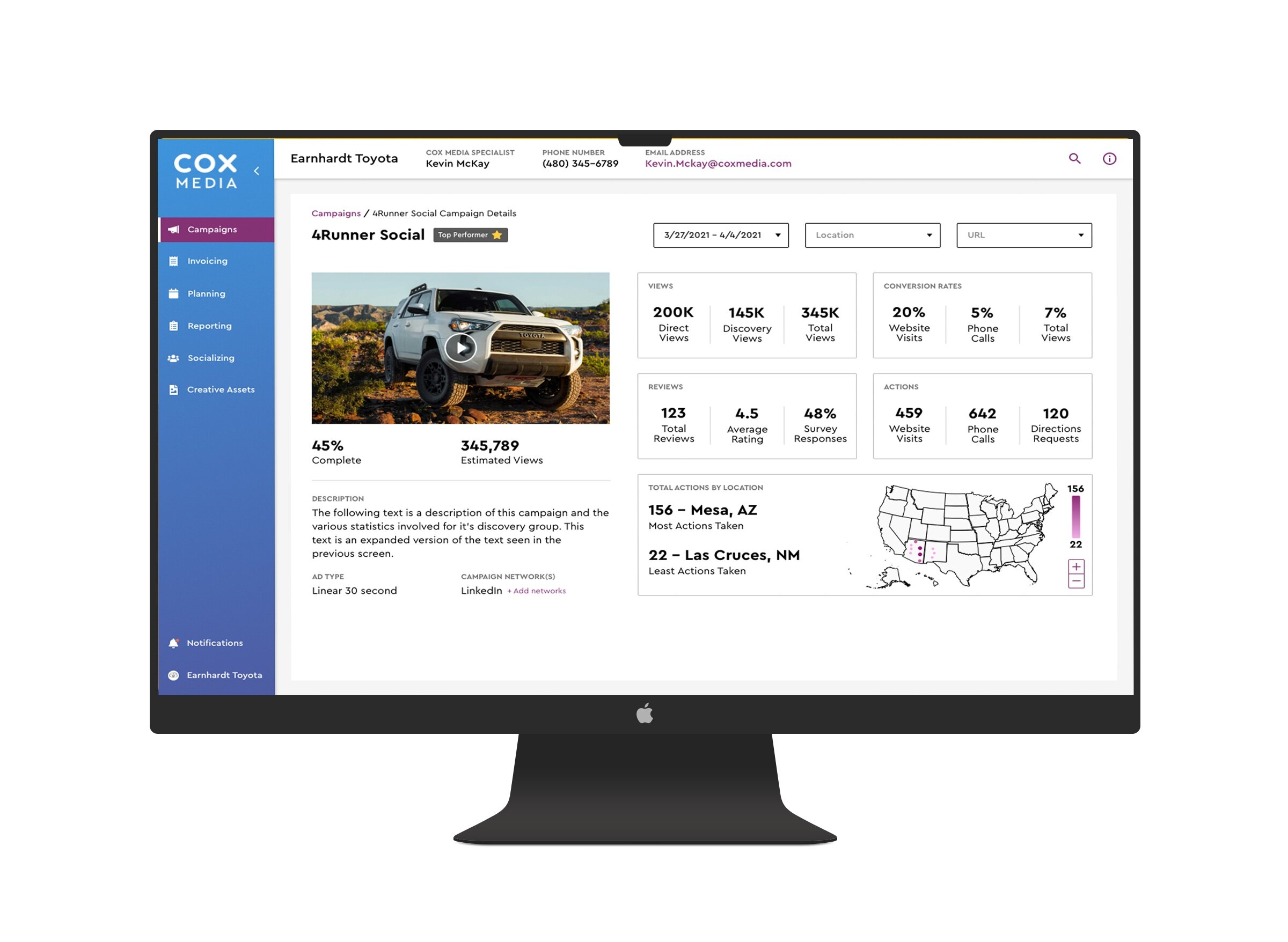
Individual Campaign Page
The detailed metrics you see on the individual campaign page come from conversations I had with the agency’s paid media and SEO specialists on what metrics a user might like to track. While I was given the Cox Media color and typography guidelines to work with, all components and patterns were created from scratch over a 4-day period.
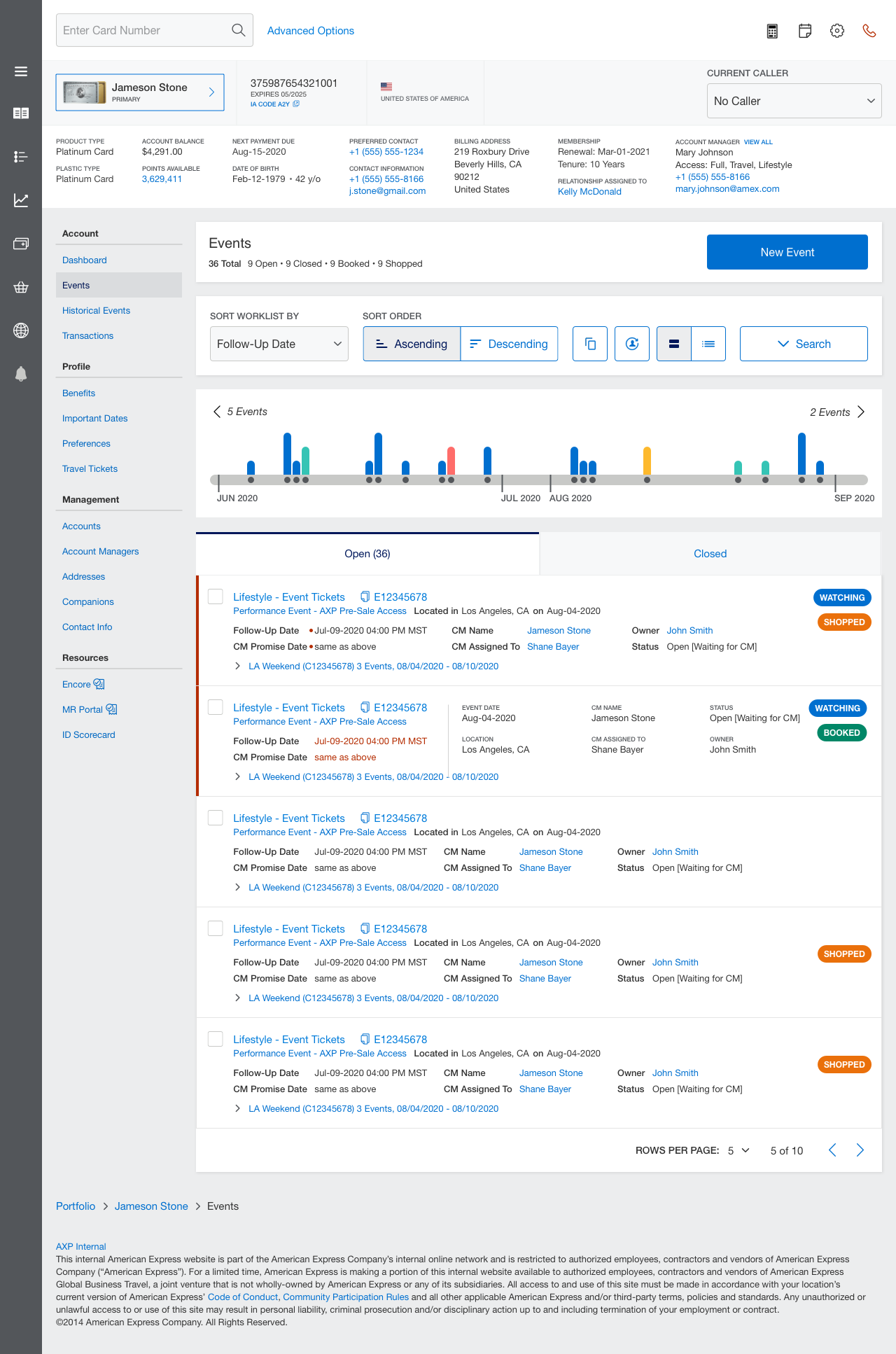
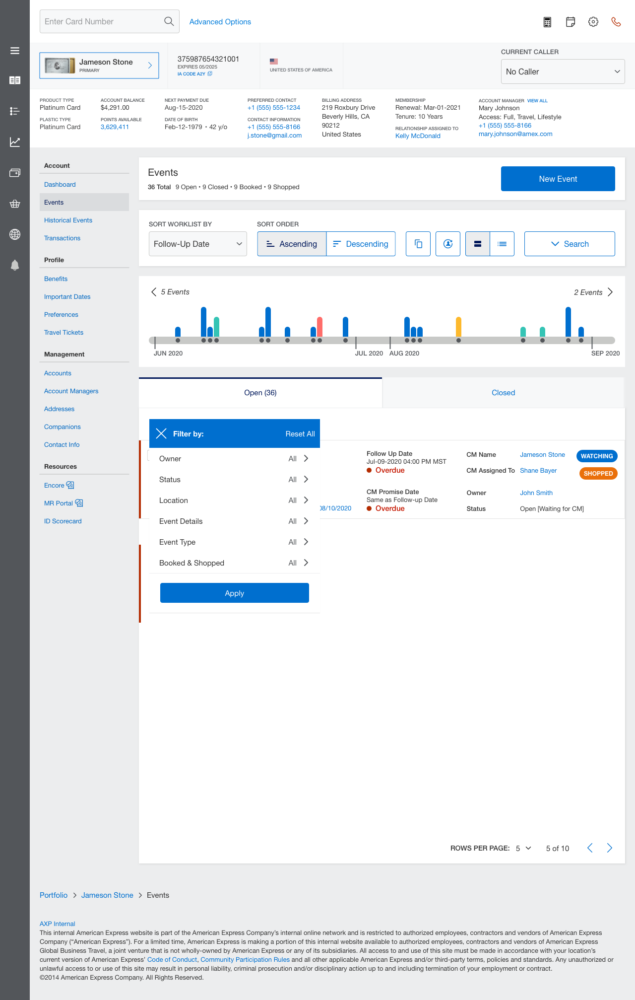
American Express (Events Tab of Card Representative Dashboard)
While working with Tallwave, I was also asked to briefly step in for a designer working on the agency’s account for American Express. The client’s ask was to set up the events tab of their card account manager dashboard, used by customer service representatives to help card members that purchased travel tickets on a company card find events at their destinations. This involved creating a new solution in an existing product/UI shell with components pulled from an enterprise design system
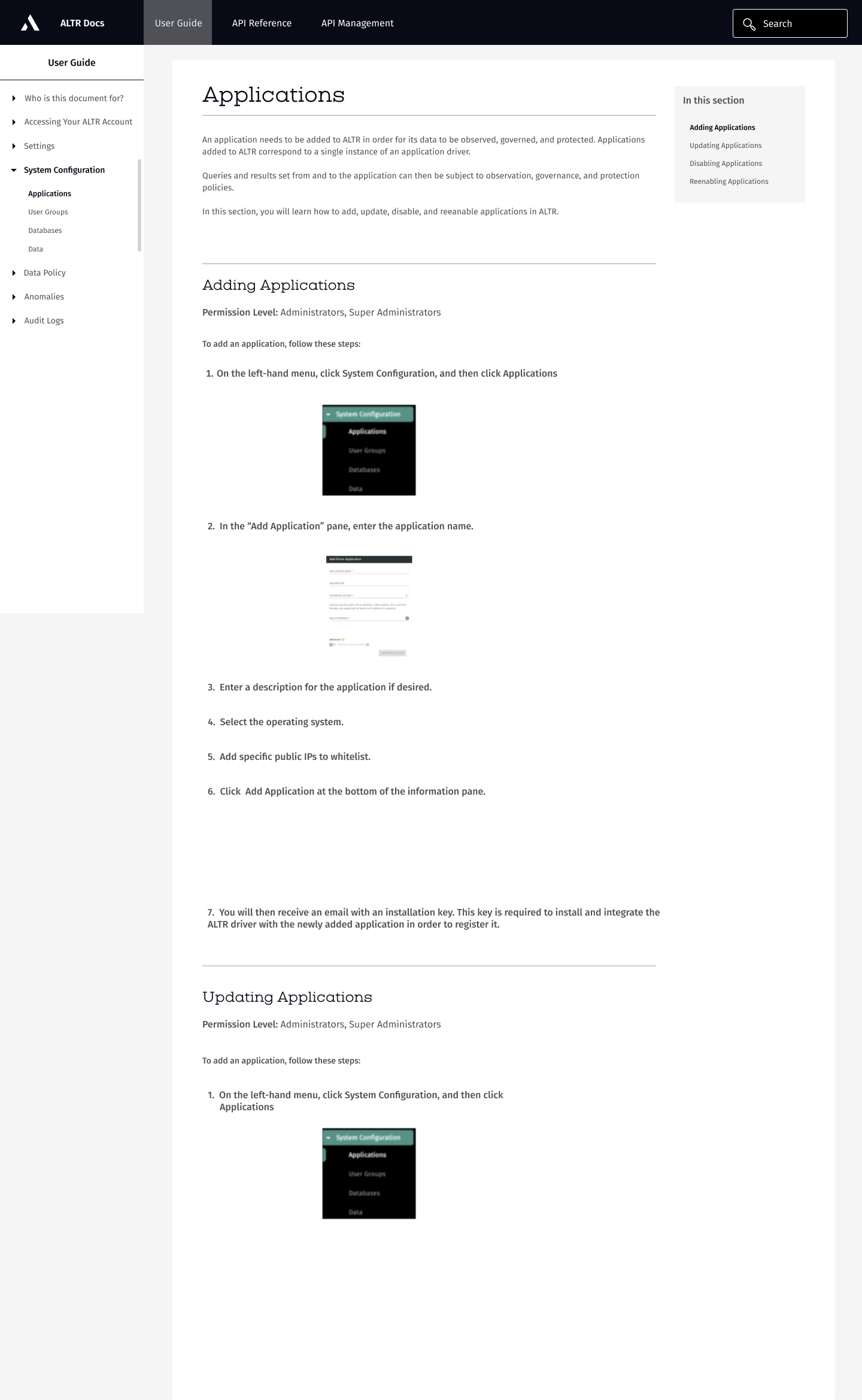
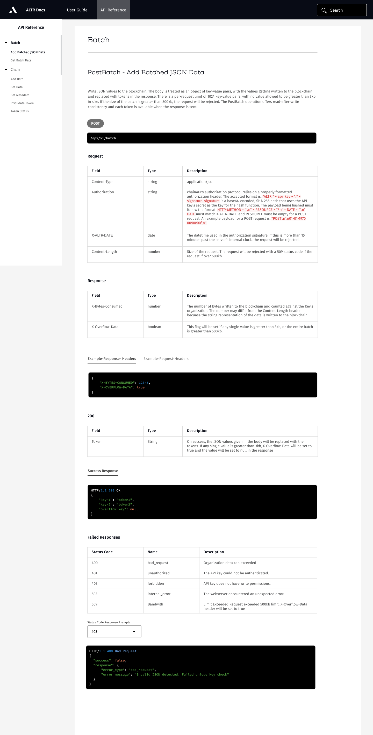
ALTR Docs Site
ALTR is a Data SaaS product that provides insights into data usage, centralized data governance, proactive data security, and reduced infrastructure complexity for users to spend less time on data lake cleanup and data integrity assurance. It connects to existing applications that clients have through API calls. I was asked to create a documentation portal housed within ALTR’s marketing website to provide content and instructions for developers integrating ALTR into their products. The goal was to provide this content and the interactions of the site such that users could easily digest the content and use it in an actionable manner.
Below are the low-fi UX wireframes I created to be handed off to a web/visual designer, who ended up building the site in a custom instance on ReadMe. The site can be viewed at docs.altr.com
BullBearChads (aka BBC Insights) Web Design
BullBearChads (now renamed SwiftSage.ai) was a cryptocurrency project that aimed to provide community members with an AI-powered analytics tool that would help users easily identify trading/arbitrage opportunities in the cryptocurrency market, and also included a token (now $SWSG).
I was responsible for creating a webpage, that, instead of using information about the tool/project or it’s value-adds, used extreme shock value that would compel site visitors to sign up for the white list and pre-sale in order to get into the community and eventually purchase the token/access to the tool.


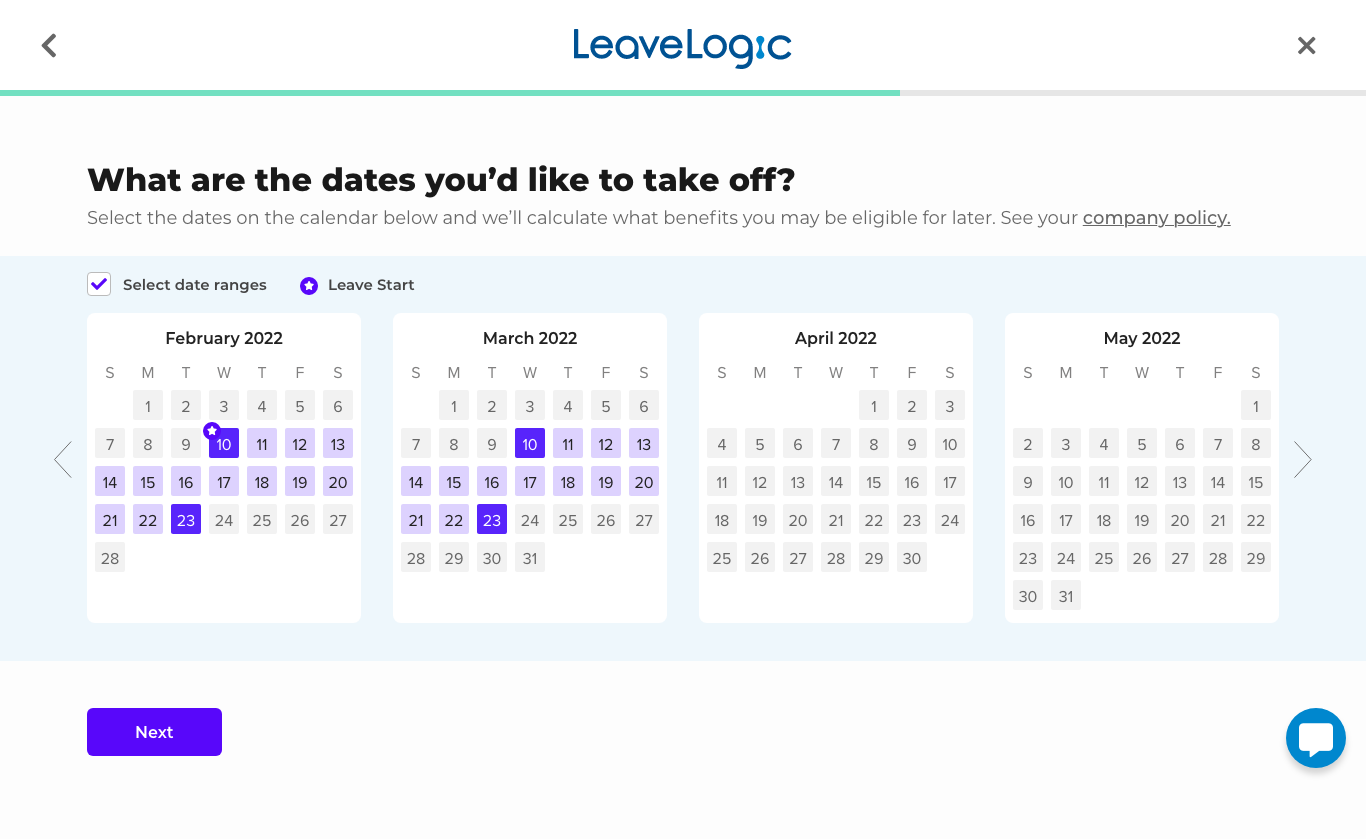
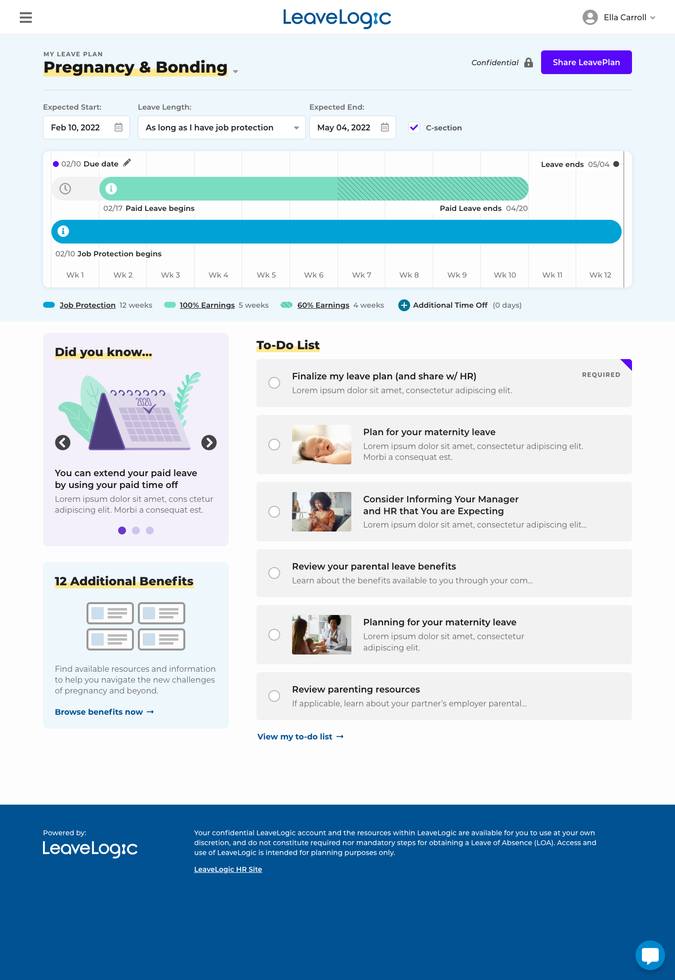
LeaveLogic (HR SaaS application - Employee Experience)
LeaveLogic is a comprehensive leave planning solution that allows the HR departments of organizations, as well as organization employees to easily navigate the complexities of leave by setting up a LeavePlan for employees based on the type of leave and length of leave they’re taking that educates employees on which benefits they’re legally entitled to, and for how long.
I designed for the employee experience, including the landing page, the onboarding process where the user answers preliminary questions related to their leave of absence, and the LeavePlan dashboard that gives users a snapshot of the benefits they’re eligible for against their leave timeline. This project involved incorporating a color scheme from a recent organizational rebrand, developing a new design system, and extensive user research.
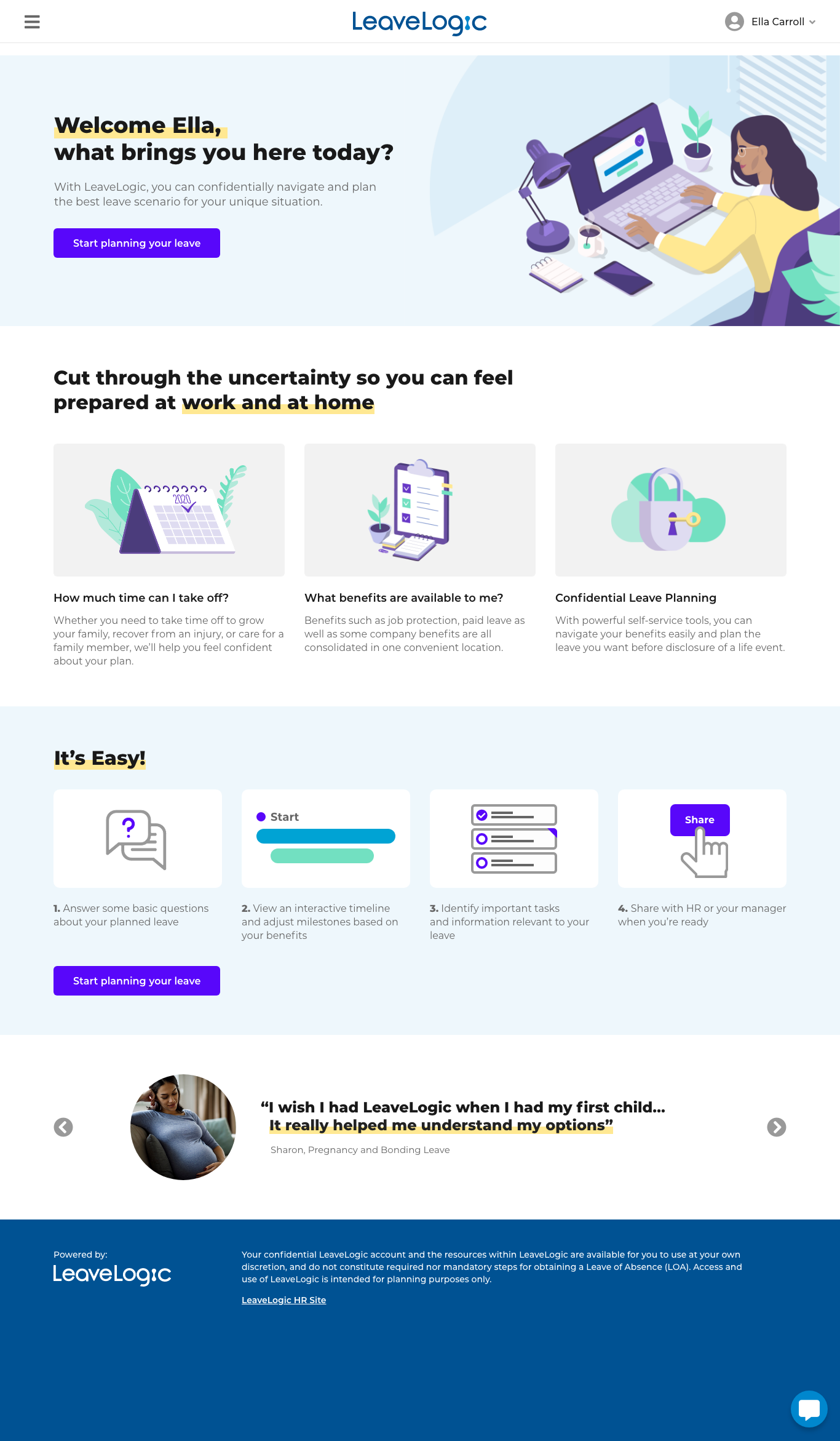
Landing Page

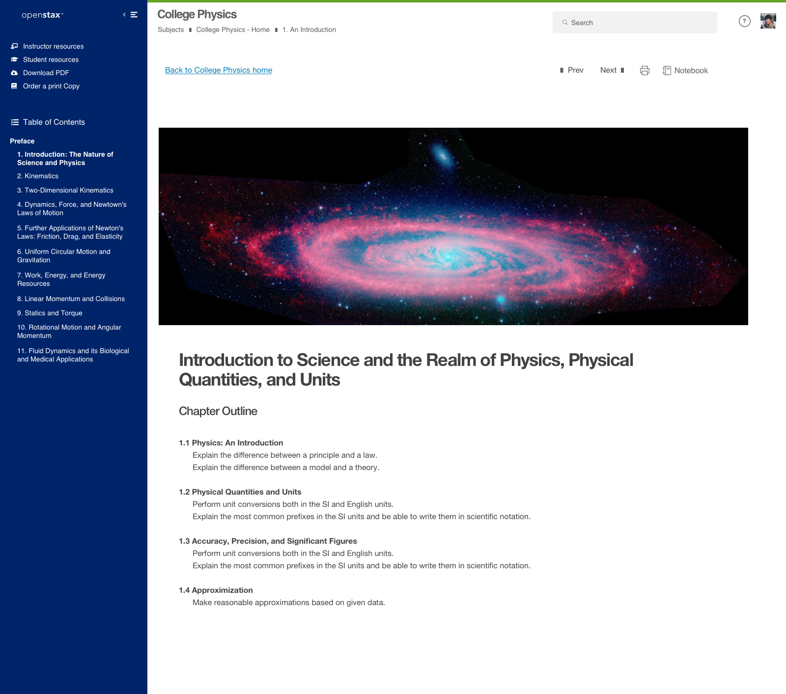
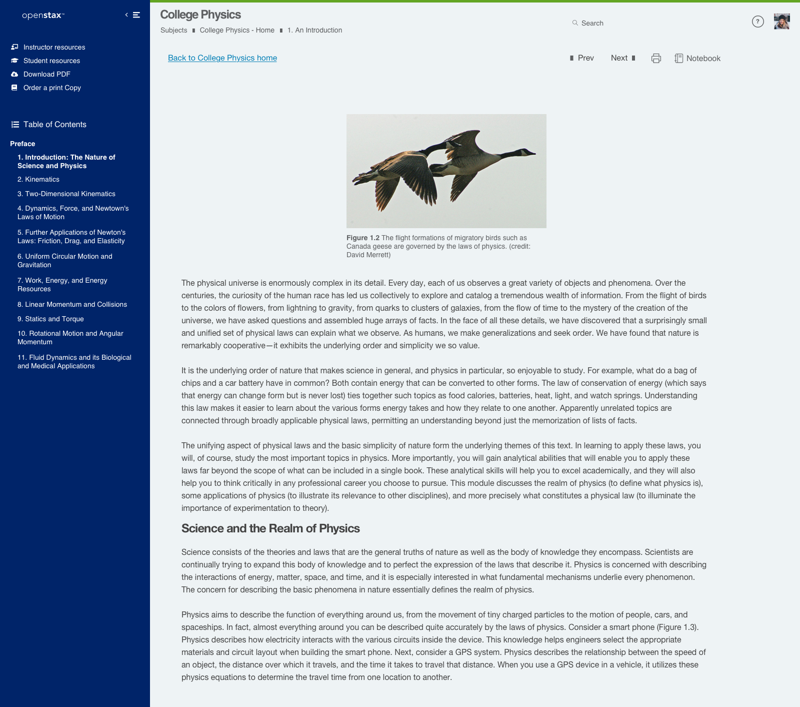
OpenStax Online Textbook Reading Experience
OpenStax is an education tech company owned and operated by Rice University that publishes high-quality, peer-reviewed, openly licensed college textbooks that are absolutely free online and low cost in print. They also operate an online education platform that gives students and instructors the tools they need for a successful academic experience.
I designed early iterations of their online textbook reading experience - aimed at providing students with easy to navigate content and note-taking functionality, as well as for instructors to easily assign classwork and distribute grades.
Like what you see or want to chat? Please contact me.
raj@rssdesign.org
RSS Design © 2025