Arizona DOT: Heuristic Review + User Research
Heuristic Evaluation report and stakeholder/user insights from performing user experience research on the Arizona DOT’s Motor Vehicle Department web portal

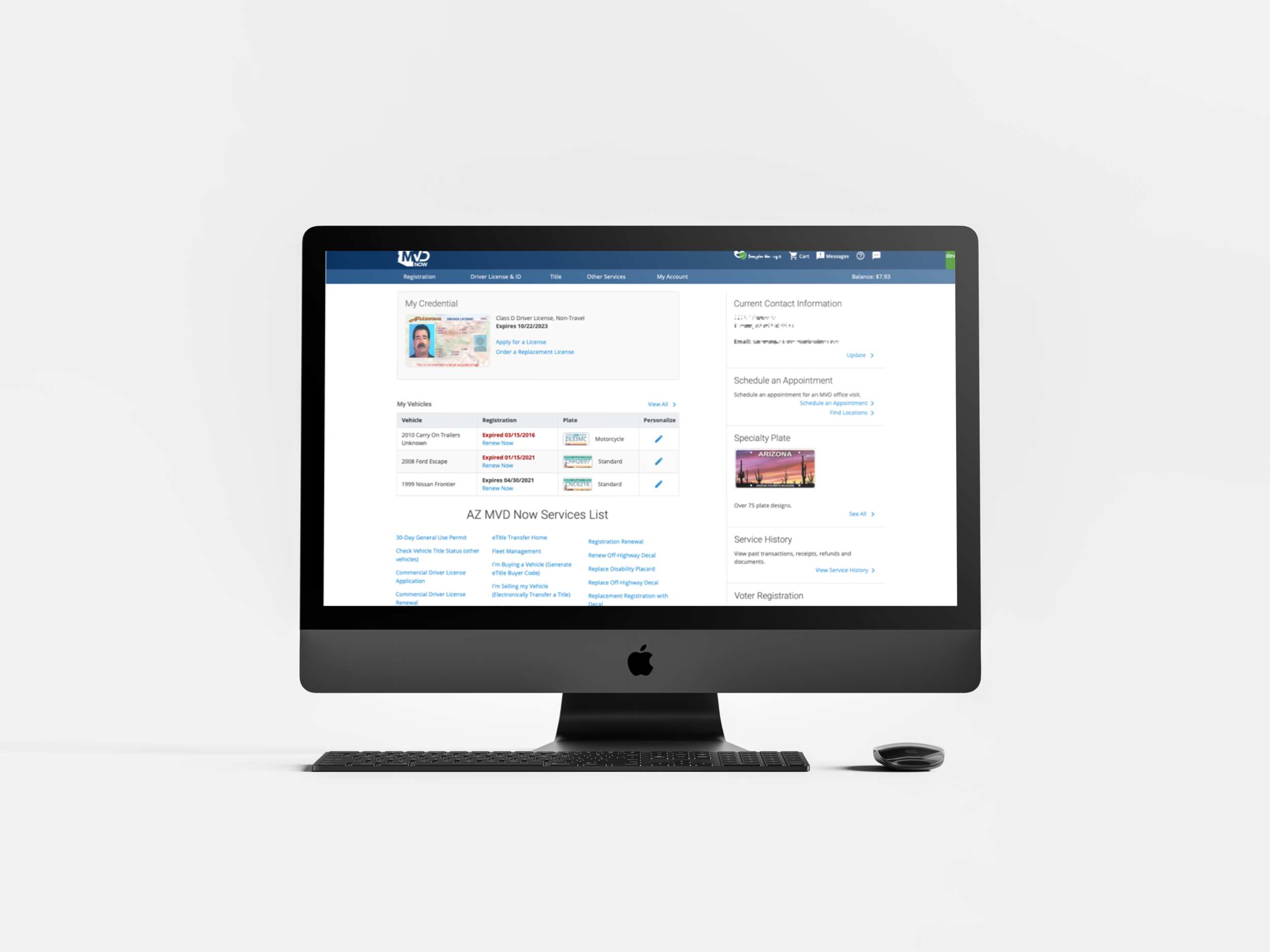
The Arizona Department of Transportation manages the Motor Vehicle Department, which Arizona state residents use to manage affairs related to their vehicle registration and driver’s licenses. As part of my contractor work with Tallwave as a Senior Product Designer, I worked with another researcher on a 3-month long UX Research Initiative with ADOT to identify current issues and areas of improvement for the MVD web portal, AZMVDNow.gov. I independently conducted a heuristic evaluation of over 50 pages of the site according to Jakob Nielsen’s 10 Usability Heuristics for User Interface Design, and assisted the other researcher with stakeholder interviews, user testing, and preparing an implementation roadmap with Tallwave consultants guiding ADOT on how to implement necessary changes over time.
My Roles
Heuristic Evaluation
Stakeholder/User Interviews
User Testing
Assistance in Preparing Implementation Roadmap
Tools
Zoom
Calendly
UserInterviews.com
Existing State of Affairs
Various personnel at ADOT and their official 3rd-party technology partner had informed us at a high-level of some of the issues that had been reported anecdotally by their customer service department which included:
Low adoption of enhanced authentication, which was required to use certain services, and of Travel ID applications, which were required by TSA for airport travel by October 2021.
Over-use of ADOT-specific terminology to describe services, limiting understanding of residents
Large volume of calls to their CSR department about not being able to find certain services on the website
The 3rd-party tech provider had also noted that parts of the web portal had a “spreadsheet-ish” look that resembled enterprise software in a technical industry as opposed to a citizen-friendly portal
We were told that metrics to examine success for implementation of research findings would include reduced volume of calls to their call center and the portal being viewed as more of a self-service tool, as well as greater adoption of enhanced authentication and increased Travel ID applications.
Stakeholder Interviews
We spoke to members of ADOT’s communications and customer service department, who echoed the above points and added the following:
Increase appointments scheduled online. There were bugs for when a user tried to reschedule an appointment, and older individuals often called to schedule an appointment because they weren’t able to activate their account.
Navigation for the dashboard had to be improved, as services and information weren’t often located in intuitive places for users to find
Workflow continuity was an issue, as form fields were often inconsistent between pages
Heuristic Evaluation
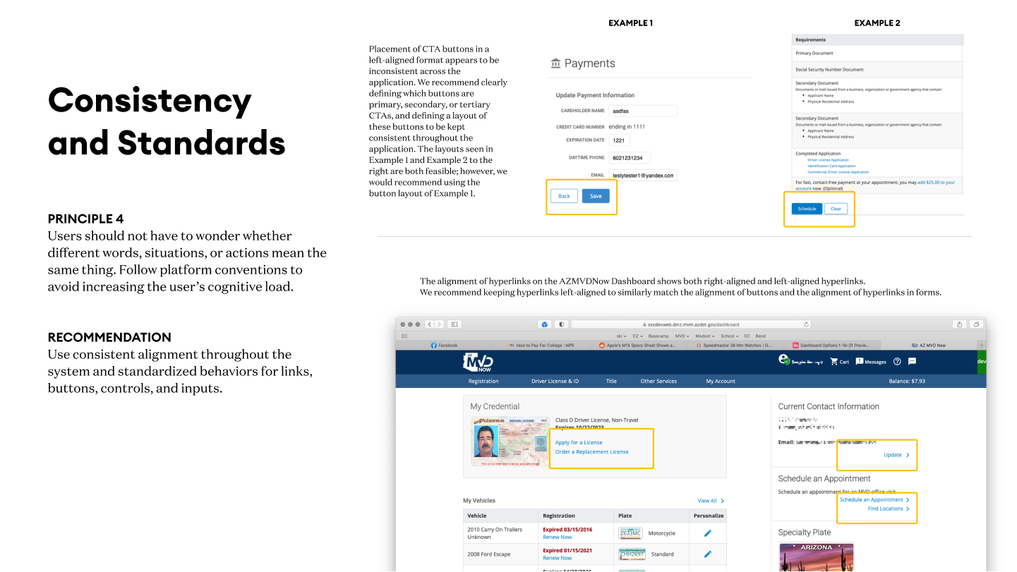
I conducted a heuristic evaluation for over 50 pages of the site, related to the following site areas/services, based on Jakob Nielsen’s 10 Usability Heuristics for User Interface Design:
Account Activation
Renew Registration
Enhanced Authentication
Travel ID application
Scheduling an Appointment
Adding/Transfering Funds
Screens and workflows were evaluated against these principles, and on a severity level from 1 - 5 (1 is very low, almost non-existent problem, 5 is major usability catastrophe). Below are the top 6 heuristic concerns found in the audit, based on frequency and severity.


Want to read the full report?
User Testing
We conducted user testing on the same services examined in the heuristic review, minus adding/transferring funds, to further augment the findings of the heuristic review. Recruitment had previously failed on UserInterviews.com, so Tallwave employees in Arizona that had not yet activated their accounts were recruited to test the site. Demographics were evenly spread between ages 26-55, and evenly split between genders and mobile vs. desktop. Our findings are listed below for each area:
Activation
Participants found the activation process to be fairly simple. However, updating and including the steps in the flow would improve the experience by making it smoother.
Showing users the login fields after clicking the “activate your account” button was the biggest
Enhanced Authentication
There is a misunderstanding of what EA is and what the benefits of enabling it are. Making the purpose and benefits more clear will help improve adoption rates
ADOT should updated the content to be more clear on what EA is and list the specific services that require EA to improve adoption
Renew Registration
Renew registration can be greatly improved by providing better system visibility indicators, and improving the layout of form fields to prevent errors
Travel ID
Locating where to apply for a Travel ID on the site was the most difficult part of the process. The majority of participants knew that a Travel ID is part of a driver’s license, but did not correlate the driver’s license application with getting a Travel ID
ADOT should place the Travel ID as a separate option in the menu so that users can easily navigate to the correct page, or add it to the current Driver License application links
Scheduling an Appointment
ADOT should add the ability for users to find the nearest location to their address or in their zip code and fix the map such that users can’t drag around location pins
On the confirmation code screen, ADOT should explain what the confirmation code is for and consider sending an email with these details/letting the user know a confirmation email has been sent.
Implementation Roadmap
I used these research findings to help Tallwave business consultants prepare an implementation roadmap that gives ADOT a gameplan on how to solve these existing issues, as well as transform the site to match the level and sophistication of the country’s best DMV sites. The work on this implementation roadmap is protected, and therefore details aren’t listed here.
Interested in learning more? Shoot me an email
Takeaways - Public Sector Edition
Working around PII (Publicly Identifiable Information) was a huge challenge here. To perform all the functions for the heuristic review/user testing, we used a UAT environment with obfuscated data records. The UAT environment crashed multiple times, and data records needed to be changed every couple of weeks.
While working on this project, I found that ADOT had used several 3rd-party integrations for the site, including Microsoft Office for phone/email verification, and MyAppointmentPlus for appointment scheduling. While some of these were necessary given ADOT’s lack of in-house technical resources, others like MyAppointment Plus could easily be swapped out for custom-built components, which would improve the user experience as MyAppointmentPlus uses a long dropdown for selecting dates, vs. a standard calendar-like date picker.
Overall, I thoroughly enjoyed conducting research on a public service, and in many ways, this project felt like my overall career came full circle, as I got my start in the world of User Experience and Product Design as a UX Researcher on program management applications for water and electric utilities.
Like what you see or want to chat? Please contact me.
raj@rssdesign.org
RSS Design © 2022
