Fortune 5 Enterprise Retail Client - UX Design/Research
Experience design and research insights from working on multiple enterprise apps for an international big-box retailer
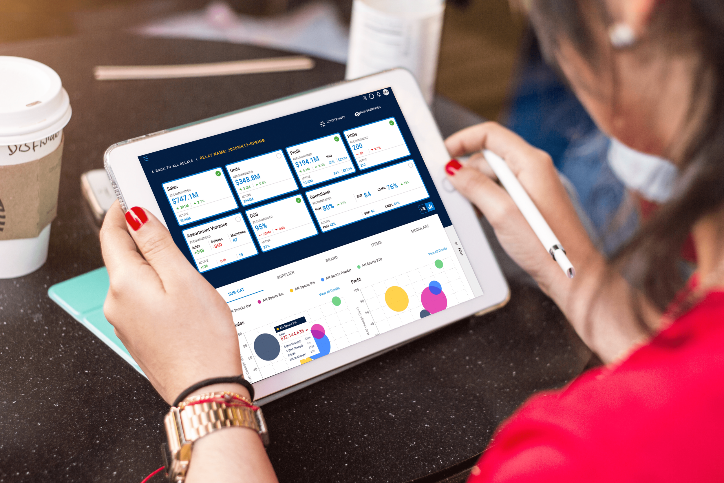
As an Enterprise UX Designer at Robots & Pencils, I served as part of a staff augmentation package for one of R&P’s largest clients, a Fortune 5 international retailer (name legally withheld). This was part of the retailer’s effort to improve the end-to-end experience of their enterprise digital products within their merchandising department. I provided UX Research and Design services for 3 different products, within the merchandising department’s Assortment unit - in charge of determining which products go on which store shelves and where.
User Research
Goals
The client had a legacy application (name legally withheld) used by the retailer’s buyers and modular space managers to perform store clustering. This involves grouping of stores based on store performance and demographic characteristics. Despite the necessity of clustering in the assortment process, several users reported to management that they preferred not to use the tool, and had developed more manual, tedious work-arounds involving Microsoft Excel, Tableau, and Alteryx. I was tasked with identifying the various pain points users had with this legacy app, as well as uncovering insight into user’s data visualization preferences to allow them to read data in their preferred format.
Methods
User Interviews
Contextual Inquiries
Tools
Zoom
Calendly
Research Findings
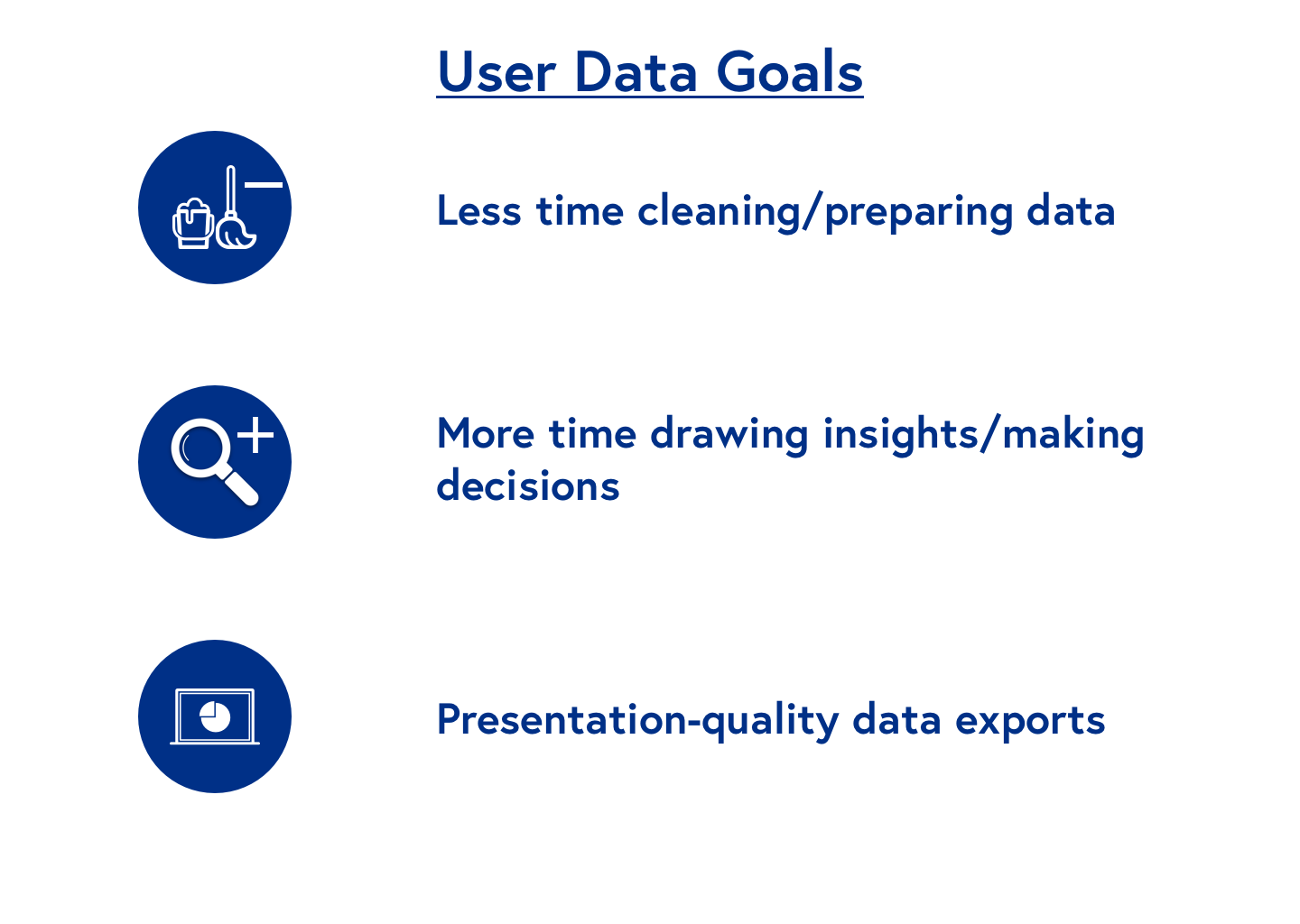
When using the product, buyers/modular space managers spent a majority of their time cleaning/preparing data and converting it to a usable format for presentations and meetings
Several users expressed a desire to spend less time manipulating the data and wanted to spend more time drawing insights - leading to more informed decision-making
The Export Data function for PDF and png didn’t produce presentation quality materials, as graphs were often stretched or too small/illegible. This was the main reason Excel, Alteryx, and Tableau were used to recreate cluster visualizations externally
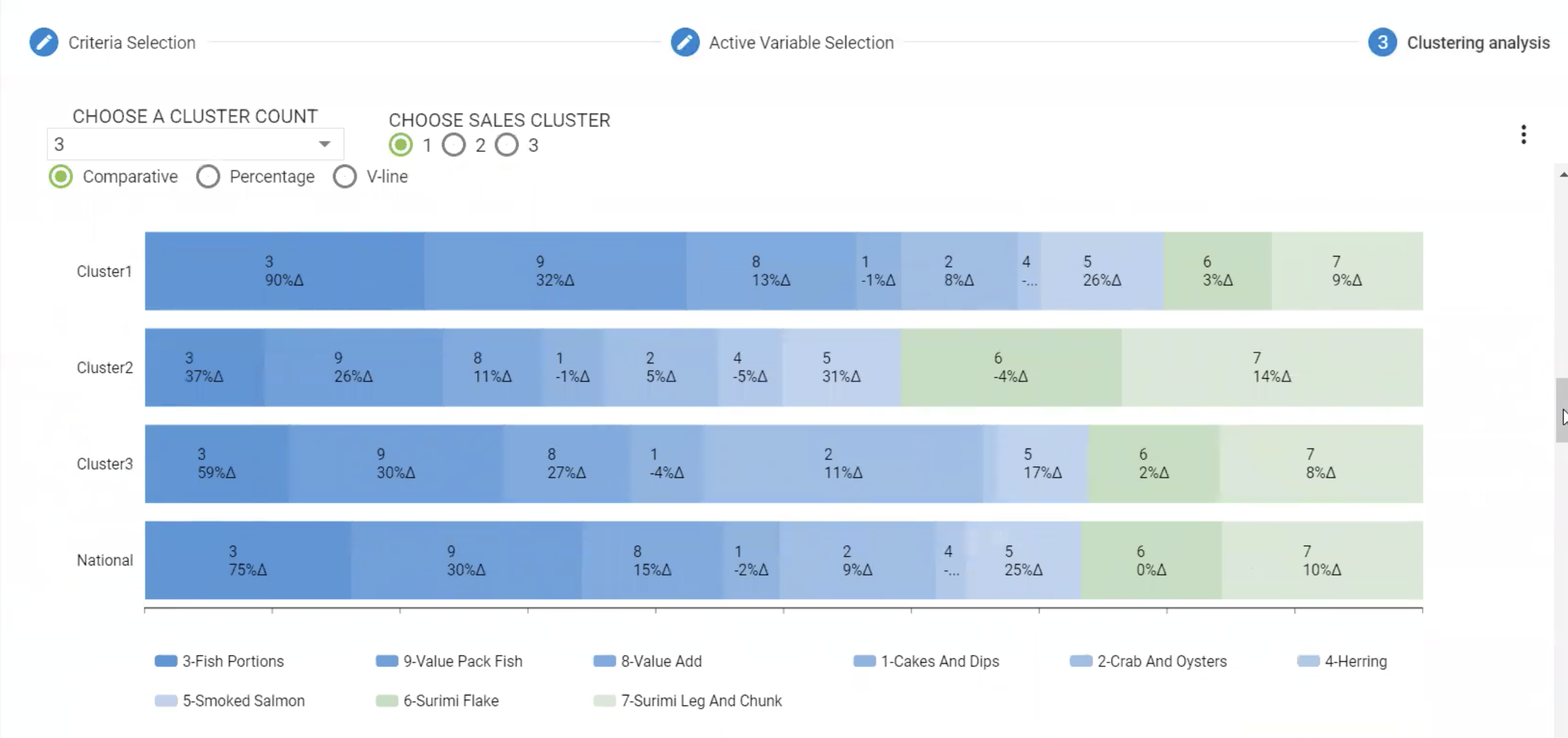
Data Visualizations were often confusing to users, making it harder to draw insights and make informed decisions
Cluster visualizations in the tool between current and previous years often looked similar due to the numerical labels used on the graphs’ axes.
Color-coding of cluster item node graphs was confusing to users, as graphs were created with different opacities of the same color, vs. using different colors for different nodes
Users preferred v-line and bubble charts to bar graphs, as these visualizations allowed users to more closely examine cluster differences.
Persona
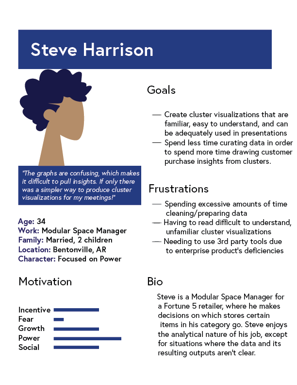
The personas I create not only identify the goals and frustrations of a user with an existing product, but also discuss their motivation for using a new or updated solution.
Based on the information communicated during user interviews and contextual inquiries, I developed a persona for Steve, a Modular Space Manager facing the common challenges of this product’s user.
Results
While the client’s product managers had received reports of low usage of the product and understood it often crashed, not much was understood of why users had problems with it. As a result of my research, the client opted to sunset the use of the product, and shift geo-clustering functionality to a new all-in-one tablet app being developed - thereby ensuring a streamlined user experience for buyers and modular space managers.
Data Visualization Design
Introduction
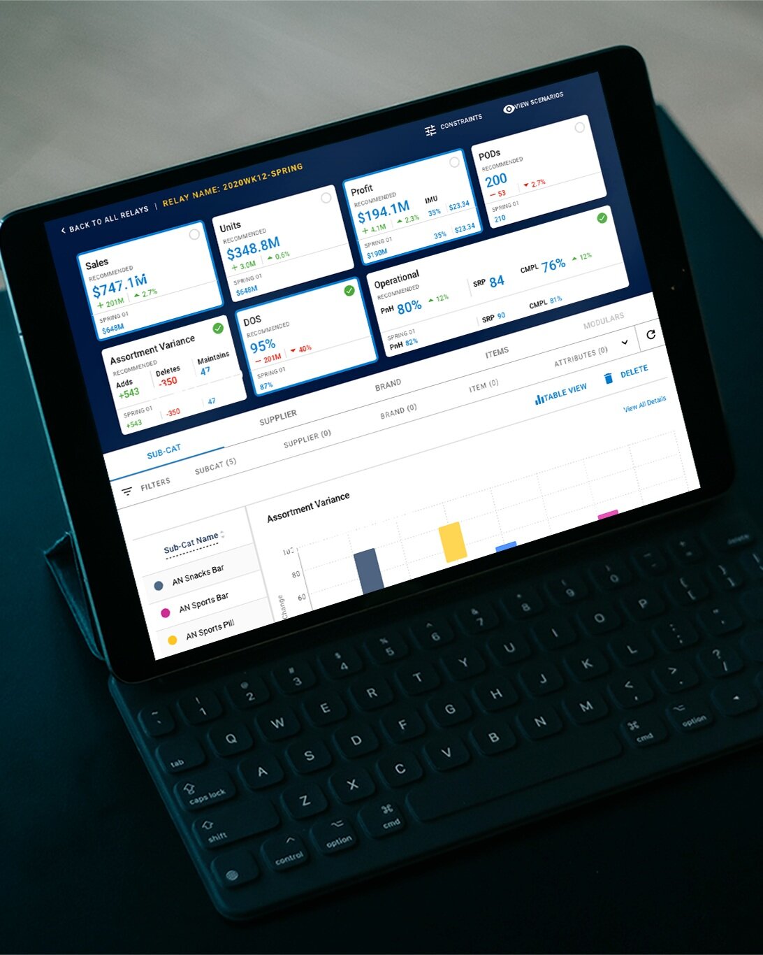
The client had a new web application being built from the ground up, for the purpose of allowing users (buyers, retail planners, and MSDMs) to assess the financial impacts of various assortment decisions. Having previously conducted research on the Assortment team’s data visualization preferences, I was asked to create various data visualizations for the financial impacts of including different items, brands, suppliers, and subcategories within a store category.
Existing Data Viz Preferences Research
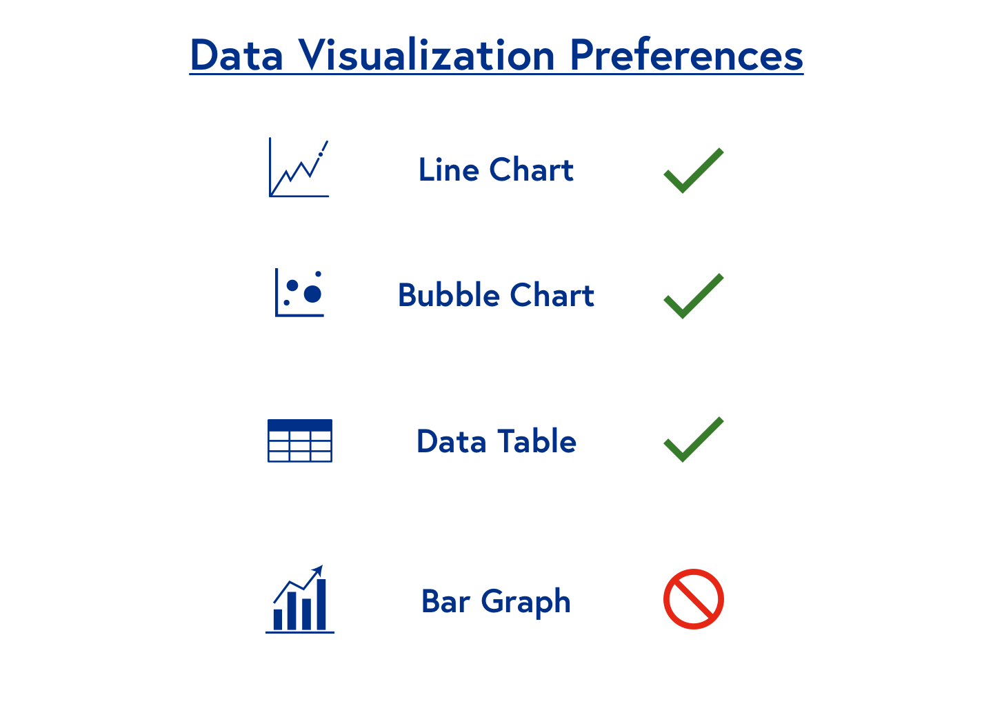
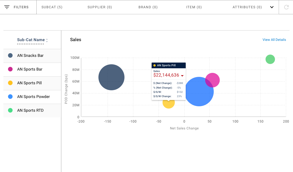
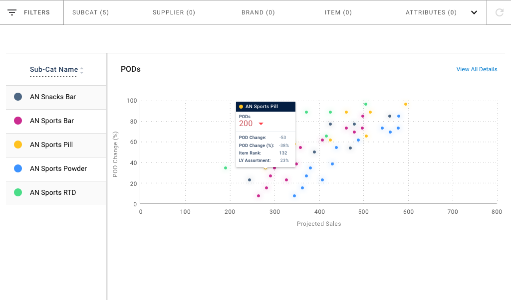
Users preferred using v-line and bubble charts for metrics like Sales, Profit, and Units
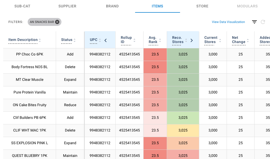
Data tables were preferred for showing changes in percentages, and the change in $/Store/Week, a very important metric for those in retail planning
Tablet-First Approach / Versatility
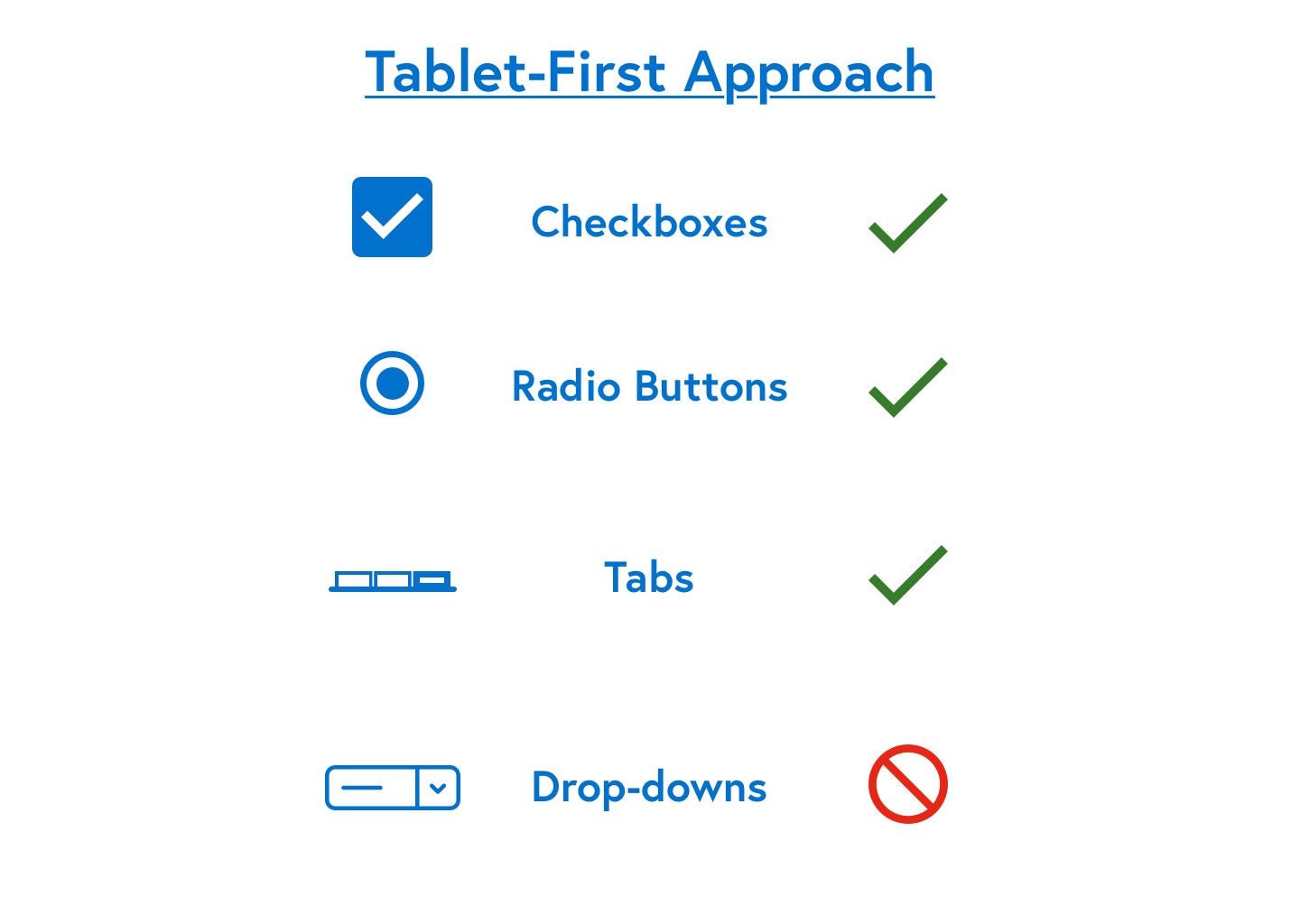
Checkboxes, radio buttons, and tabs were used in favor of drop-downs for many actions due to the Assortment team’s decision to have buyers and modular space managers use iPads to create ease for presentation in meetings.
Results/Mockups
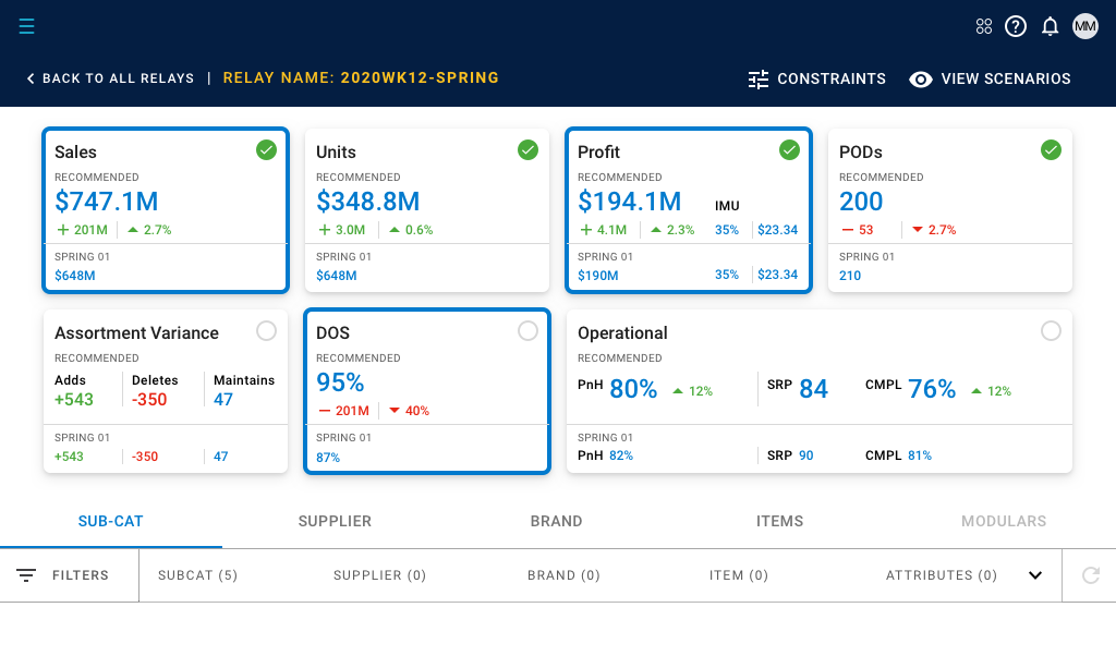
The end product resulted in aesthetically pleasing visualizations that users were not only familiar with, but also able to pull insights from more easily.
UI Design
Introduction
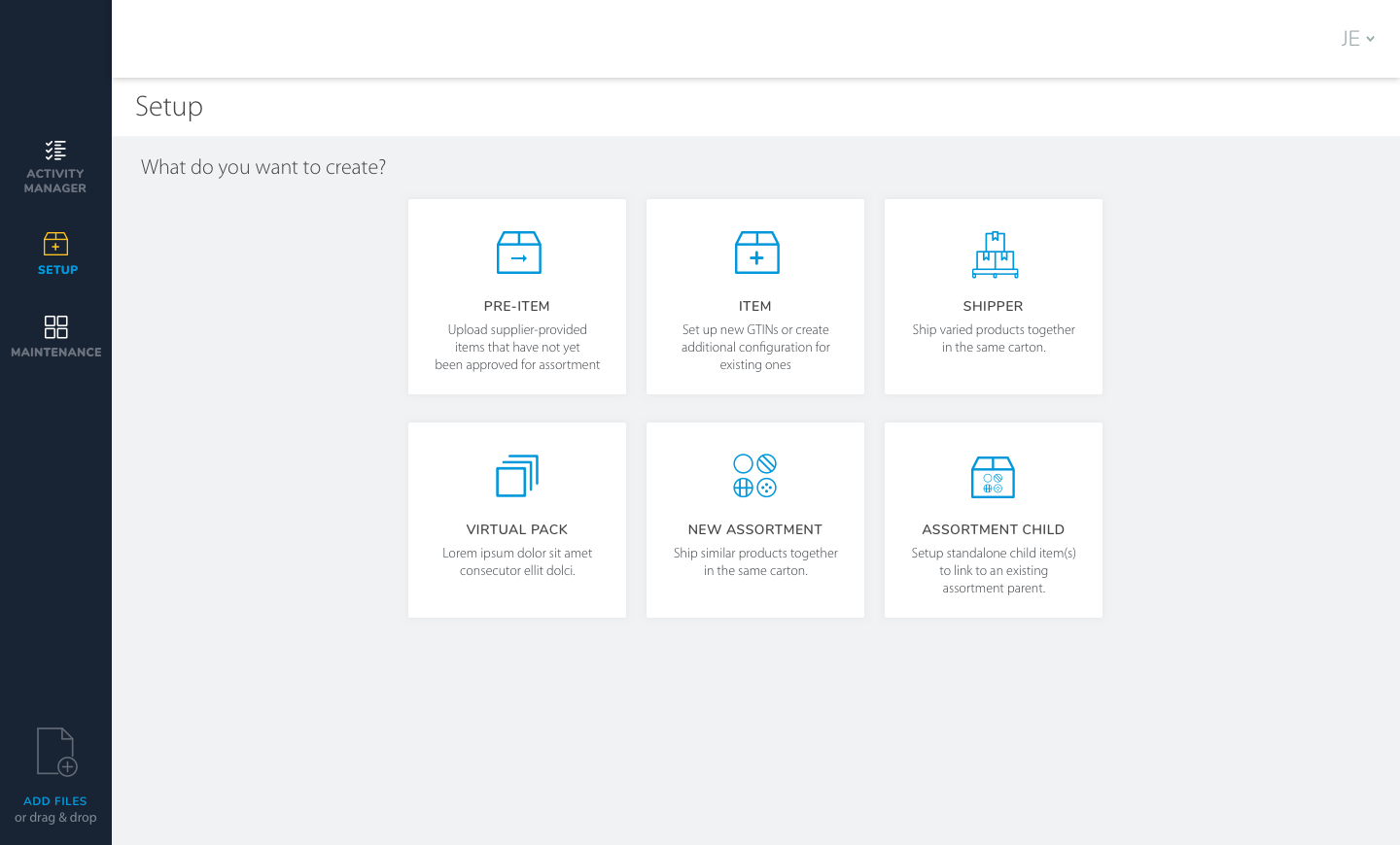
During my time working with client, I also worked on a 3rd application that was primarily used as an inventory tool for retail planners to add new items and suppliers to a global organizational catalog, pending approval. These were to be uploaded as “Pre-Items.” The tool was previously used by retail planners for the retailer’s online catalog, and was being expanded to allow retail planners for store assortment. I was asked to design new modules within the app for Pre-Items.
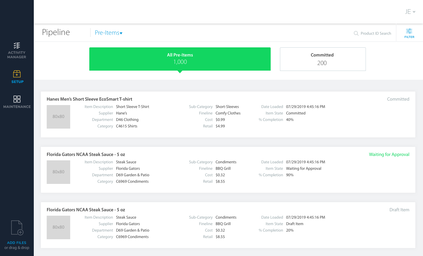
New Functionality - Existing Product
Unlike the tablet app mentioned above, this product was used by e-commerce buyers and already had an existing design language to be utilized. The main significance here was for me to design new functionality in an existing product, to be scaled up in the future with additional functionality.
Since Pre-Items for store assortment was a concept in early stages, its various states (Pre-Item, Committed, etc.) were not clearly defined. My design here uses pre-existing components as a foundation to accommodate future Pre-Item states being added in the future.
Takeaways
Enterprise products aren’t always set up to accommodate future functionality, but they can be
Story mapping workshops are an effective tool to work with product managers that have difficulty defining acceptance criteria for user stories
The client’s new tablet app was an opportunity for me to improve and showcase my data visualization design skills - something I now pride myself on
Overall, my time working with this client not only taught me quite a bit about the enterprise retail world, but more importantly how digital products are conceived, designed, and shipped at larger, multinational corporations (I had worked primarily with smaller companies/startups prior to this position)
Like what you see or want to chat? Please contact me.
raj@rssdesign.org
RSS Design © 2022
