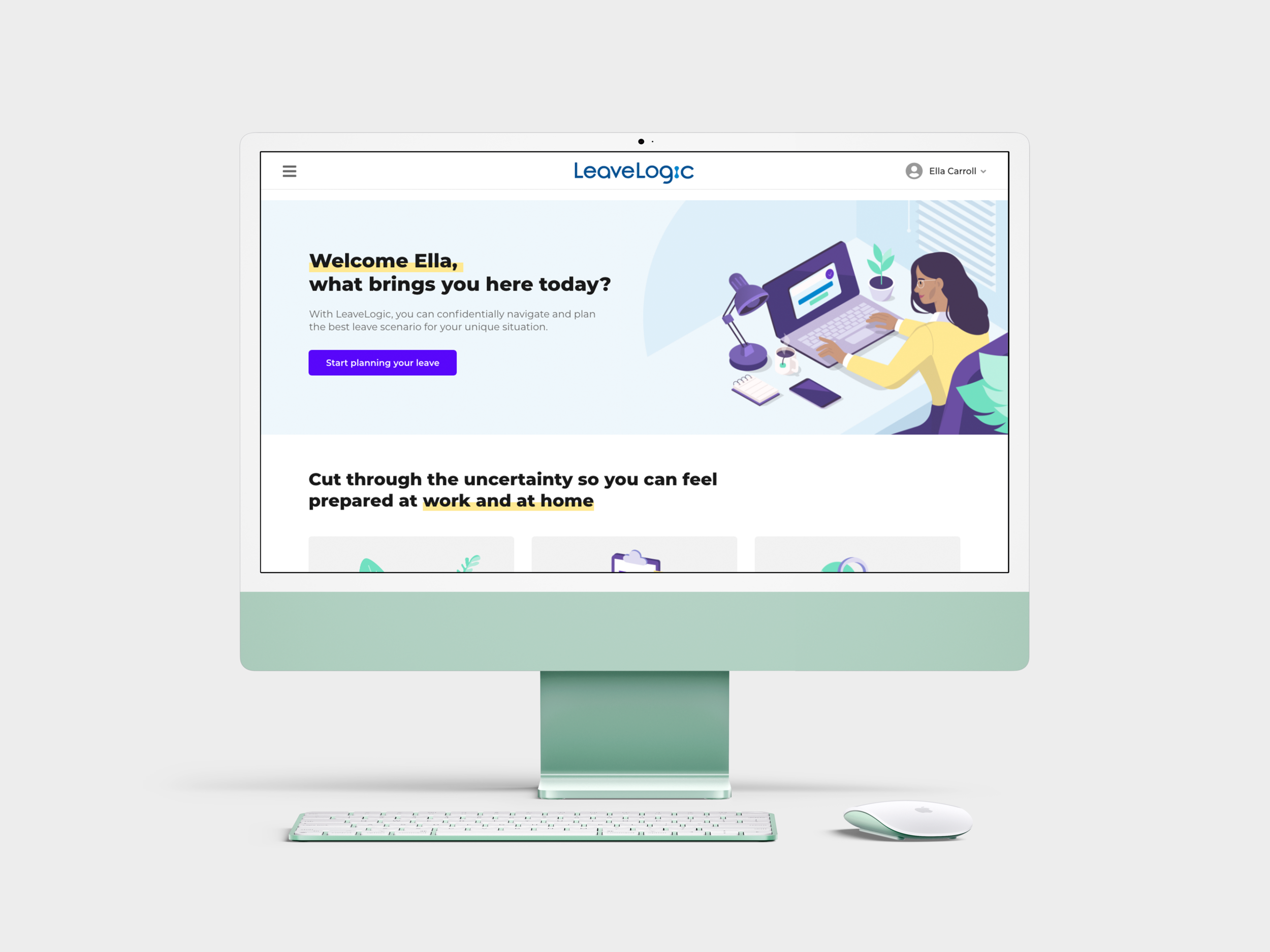
LeaveLogic SaaS UX Design/Research
Research insights, feature redesigns, and new feature experience design from working on an Human Resources SaaS for organizational employees to plan a leave of absence from work.
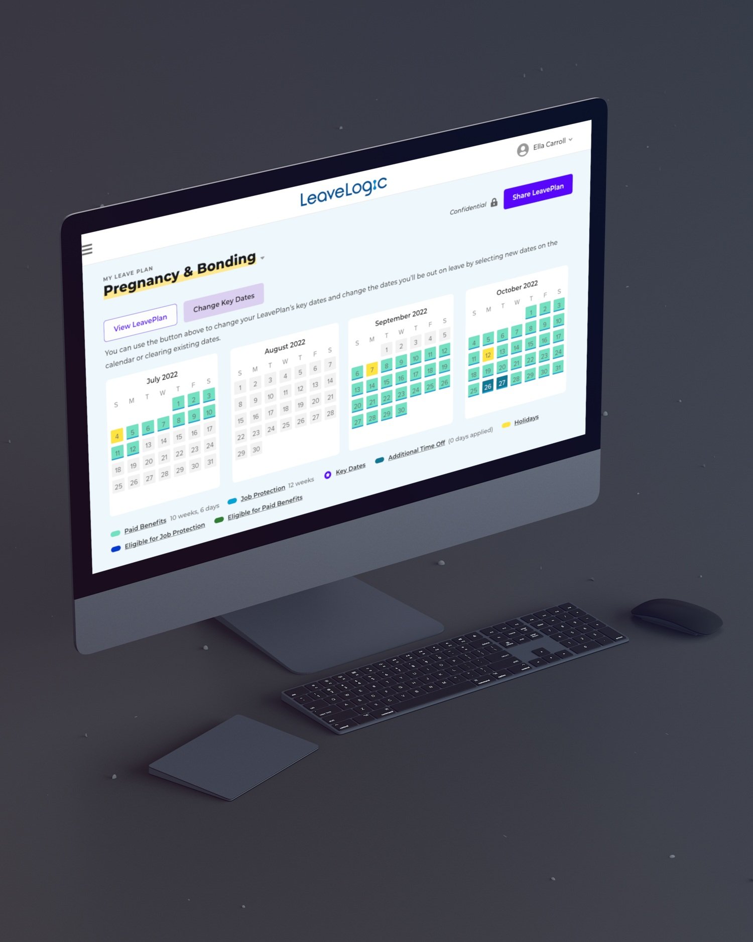
LeaveLogic, a subsidiary of the Unum Corporation, is a B2B SaaS application used by employees at organizations of various sizes to plan the process of taking a leave of absence for a variety of potential reasons. The application asks users to answer a series of questions in onboarding, then presents them with a tentative LeavePlan, detailing the time they’ll be out on leave, the municipal, state, federal, and company benefits they’re legally entitled to, and presents them with a list of required and suggested to-do items to take care of before, during, and after their leave of absence.
I worked on contract for six months for Unum, who assigned me to work on LeaveLogic as a Senior UX Designer. After inheriting an MVP and design system from a previous designer, I added some components to the design system, and led design for multiple new features. I also worked with cross-functional team members to accurately define user stories and acceptance criteria, refined personas with LeaveLogic SMEs, and conducted user research with both UserInterviews.com participants and existing LeaveLogic Users.
My Roles
UX/UI Design
User Research
Product Management/Strategy Development
Prototyping
UX writing/Copywriting
Tools
Adobe XD
Adobe Illustrator
UserInterviews.com
unDraw.co
Personas
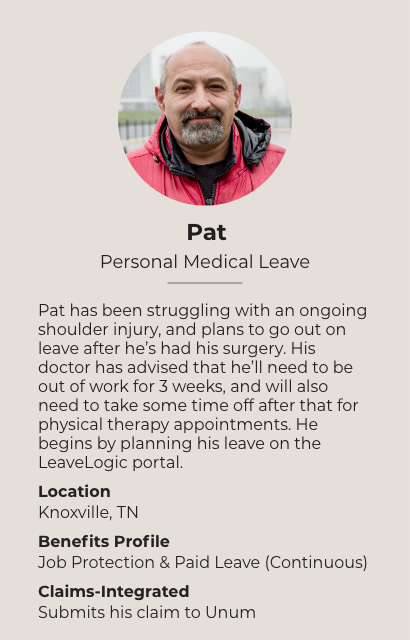
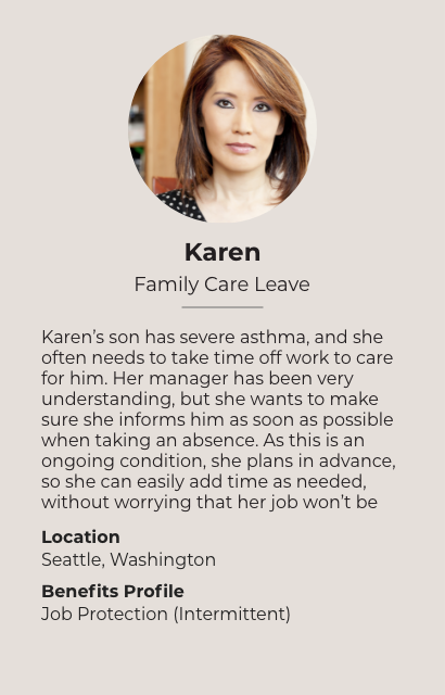
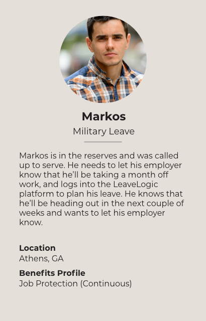
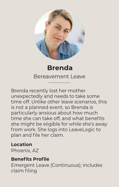
Leave of absence can be taken for a wide variety of reasons, which according to subject matter experts at LeaveLogic, fall into 6 main categories: Maternity Leave, Parental Adoption Leave, Personal Medical Leave, Family Care, Military, and Bereavement Leave.
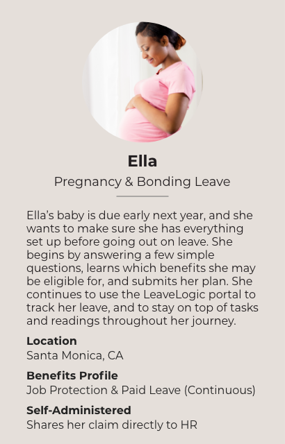
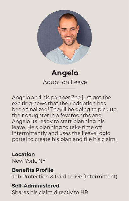
When working on the employee experience of this application, I worked with the LeaveLogic SMEs to create “proto-personas” (seen below) that defined the main areas of the application users with specific leave types would interact with most closely, whether they were likely to take their leave continuously (all-at-once) or intermittently (broken up into blocks of time), and whether they were self-administering their benefits claims with an HR department or 3rd-party company. In the application, different personas often have to answer different questions in onboarding, interact with different pieces of information, and may place greater value on other parts of the application (to-do list with tasks, benefits sources, claims submission) than users of other leave types.
Design System Additions
The previous designer at LeaveLogic had left behind a foundational design system that was visually well done, but lacked certain key elements. They created button components, but did not however create any link components, which I created as multiple features I worked on required the use of a link component. I also created the navigation menu options, for scenarios taking into account whether or not a user has created a LeavePlan, as well as multiple LeavePlans. Using the previous designer’s radio button component, I created a selectable card component to be used in the checklist functionality of the product’s “To-Do List” feature.
Additions not pictured: error states, forms (both 1 and 2 column layout), interactive modals
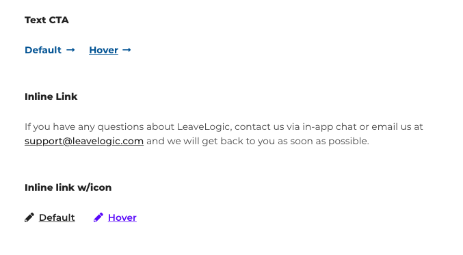
Text CTA and Inline Links
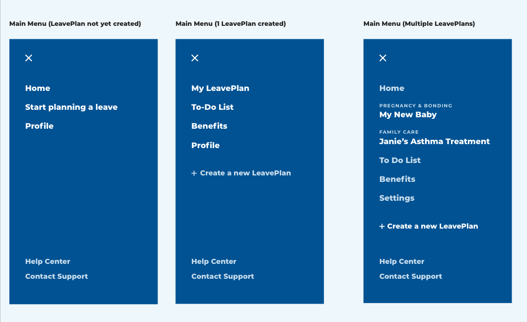
Navigation Menu Options

Selectable List Item Components
Prototype
Below is a prototype of the MVP user experience I helped design and finalize requirements for.
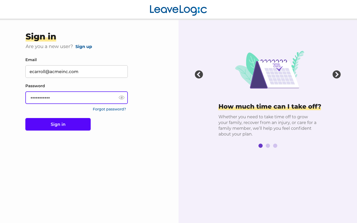
It shows the onboarding process where information is collected about a user’s leave of absence parameters, and afterwards, a user is subsequently able to see the financial benefits they’re legally entitled to at a high level, while being able to drill into specific details of each benefit. When they first log in, they’re given a product tour of features available to them (full tour not in video). They’re also given a “to-do list” that details tasks they need to complete for HR purposes before, during, and after their leave of absence. When they’ve finished customizing and consuming information on their LeavePlan, users are able to submit it to their organization for approval or file a claim with their organization’s 3rd-party claims handler (full flow not in video).
Calendar Editing
Previously, there was no way for users to edit their LeavePlan or change the parameters of their leave of absence once they had created a LeavePlan in LeaveLogic. To make changes, they would either have to delete their existing LeavePlan and make a new one, or have their HR or 3rd-party claims representative manually make changes, causing difficulties and delays in finalizing their LeavePlan.
Thus, LeaveLogic decided to spend time and effort developing a feature for LeavePlan editing. Their goal was to have a calendar interface in which users could change the dates of their leave, as well as the specific milestone dates associated with their leave (i.e. Disability Start Date). Users would also be informed of the subsequent changes to their benefits eligibility after editing their LeavePlan. The rationale for a calendar interface came from LeaveLogic SMEs, who reported that users would often look at some type of a calendar while planning out their leave of absence.
Requirements
Ability to change the dates of a LeavePlan, by selecting dates/date ranges and adding them to or clearing them from a LeavePlan
Ability to convert dates and/or date ranges to time off, either PTO or unpaid time off
Ability to change milestone dates of a LeavePlan (i.e. Disability Start Date, Disability End Date, etc.)
Ability to see changes in benefits eligibility as a result of editing one’s LeavePlan
First Round of Design
Below is a prototype of the earliest design iterations on calendar editing. Here, we see a user change the dates on their LeavePlan, breaking up their continuous (all at once) LeavePlan into two blocks of intermittent leave (spread out over time).
Product Requirements Changes/Feedback
Product management had previously thought there would be no issue if a user changed all of their key dates, or LeavePlan milestones, at once. However, it was concluded while an unlikely use case, changing all key dates at once would lead to LeavePlans being created that would fall out of what users would be entitled to either legally or by their organization. Thus, they decided to only enable changing one key date at at time, along with error states created for different rules that needed to be met when changing key dates. This made sense to me from a UX perspective, as changing each key date would lead to changes in benefits eligibility, which users should be kept abreast of.
Product management also asked to account for what the benefits eligibility table would look like in the event of intermittent leave taken in several different blocks, as that was anticipated to be a common use case.
User Research/Feedback
Usability testing was done to assess whether the methods of calendar and date editing were intuitive and matched users’ mental models, as well as evaluating if users were adequately aware of how their benefits eligibility was changing as a result of date changes. Test participants were given the task of changing a continuous LeavePlan to an intermittent LeavePlan by changing the dates.
While users had little to no issue with adding/clearing dates from the calendar interface, they were often unaware of how their benefits eligibility had been affected. As a result of user feedback, the following changes were made:
Change in placement of “Updated” badge
To become more visible to users, I moved the placement of the “Updated” badge from the right to left
Change from “100%/60% benefits” to “Paid/Partially Paid Benefits” terminology
Multiple users experienced confusion over the 100% and 60% benefits labels, and were not concerned with percentages for partially paid benefits. The terminology in the app was changed, with tooltips appearing on hover to better explain the concept of partially paid benefits
Change from “Key Dates” to “Milestones”
I had incorrectly assumed that something like “Key Dates” would be more intuitive to users as opposed to “Milestones,” the original term used by product management. I was wrong, so I changed it back :)
Change to 4 columns from 3 columns for the Benefits Eligibility data table
For better organization of information, and to make the eligibility dates and eligible amount fulfilled of each benefit more apparent, I reorganized the benefits eligibility table with 4 columns instead of 3. This also reduced row height of each table
Final Designs
Below is the most recent version of the Benefits Eligibility data table to be implemented showing the changes in layout, as well as the new user flow for changing one’s milestones - updated based on newer product requirements.
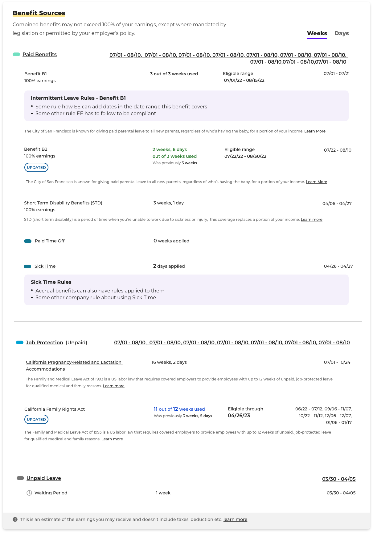
Other Features
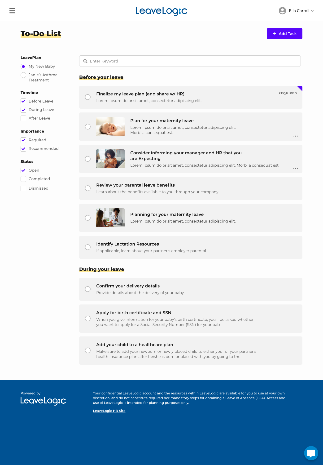
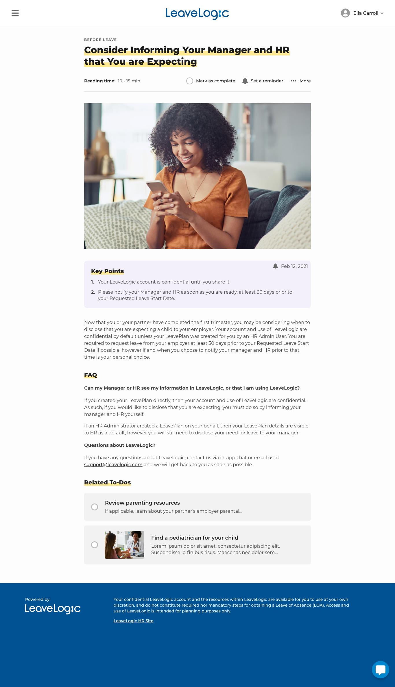
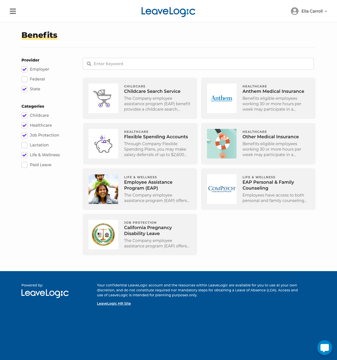
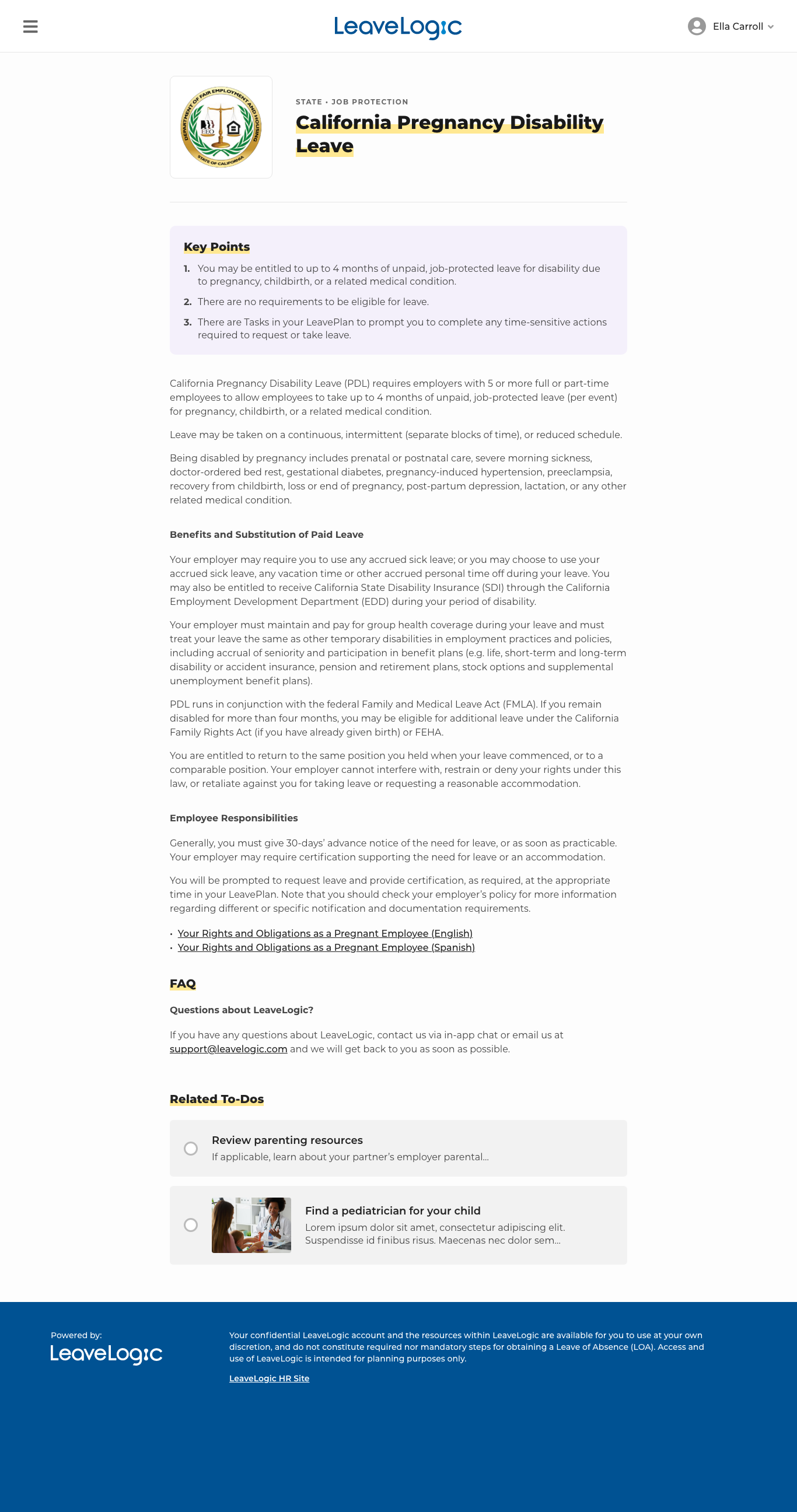
While helping to refine the onboarding process and calendar editing took up most of my time at LeaveLogic, I also lent my hands to other feature work, including the To-Do List/Benefits features and the downloadable LeavePlan seen below.
To-Do List/Benefits Main and Individual Pages
While the LeavePlan is intended to present a high-level overview of benefits coverage users are entitled to, the To-Do List and Benefits hubs were intended to present easy to navigate lists of benefits and to-do list items, in addition to drilling down into more specific details about these benefits/to-do list items.




Downloadable LeavePlan
Though the LeaveLogic app has a function to share one’s LeavePlan with their manager/HR department, the downloadable LeavePlan allows users to download their LeavePlan as a PDF to share all relevant details with 3rd parties outside their organization.
Takeaways
Context is important with legality is involved
LeaveLogic is a product that gives users access to legal information - in this case, what financial benefits they are entitled to during their leave of absence. This is not simply a case of informing users what they have access to within an app, the information displayed corresponds to their real-life legal existence.
Some users of the tool have taken multiple leaves and are familiar with the process at their organization, others are jumping in for the first time.
Thus, any tool that deals with legal information needs to give exact context for a user and notify users how benefits will change as a result of changing their plan’s parameters, regardless of whether it’s common knowledge.
People don’t always read :(
Despite our inherent need to read the fine print when dealing with legal matters, some user testing participants reported not reading instructions or participating in product tutorials
Some are filling out forms to go on leave at the last minute and are in a hurry, others are simply not the type of people to read detailed instructions
How does one deal with this? Try to separate large amounts of information into digestible chunks that can be viewed and read one at a time. Make the information easy to access after viewing it the first time. And place this information in areas of the screen where users’ attention is focused.
Going manual vs. out-of-the-box solutions may be more effective
The product tour functionality that had been previously developed and used initially for calendar editing was out-of-the-box functionality from PX.
Despite the proposal of doing a custom product tour for calendar editing, which would have allowed users to make sample changes themselves, this out-of-the-box solution from Intercom was chosen due to development constraints.
Given the feedback from user testing, it’s reasonable to assume that a custom product tour would have taught users better and given them the adequate visibility into benefit changes rather than just telling them to look below at the table
Like what you see or want to chat? Please contact me.
raj@rssdesign.org
RSS Design © 2022
